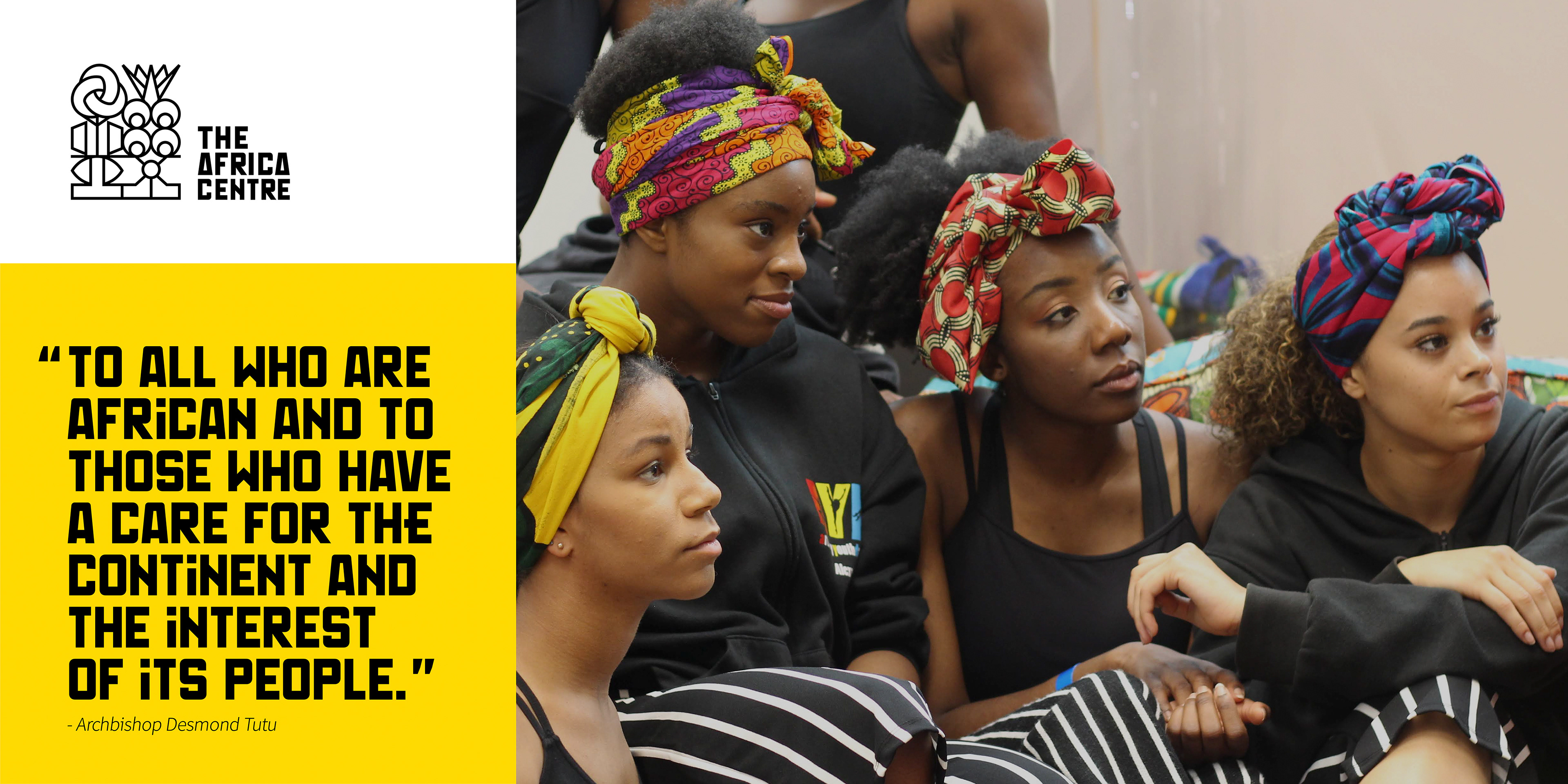
Celebrating Africa's cultural richness and identity
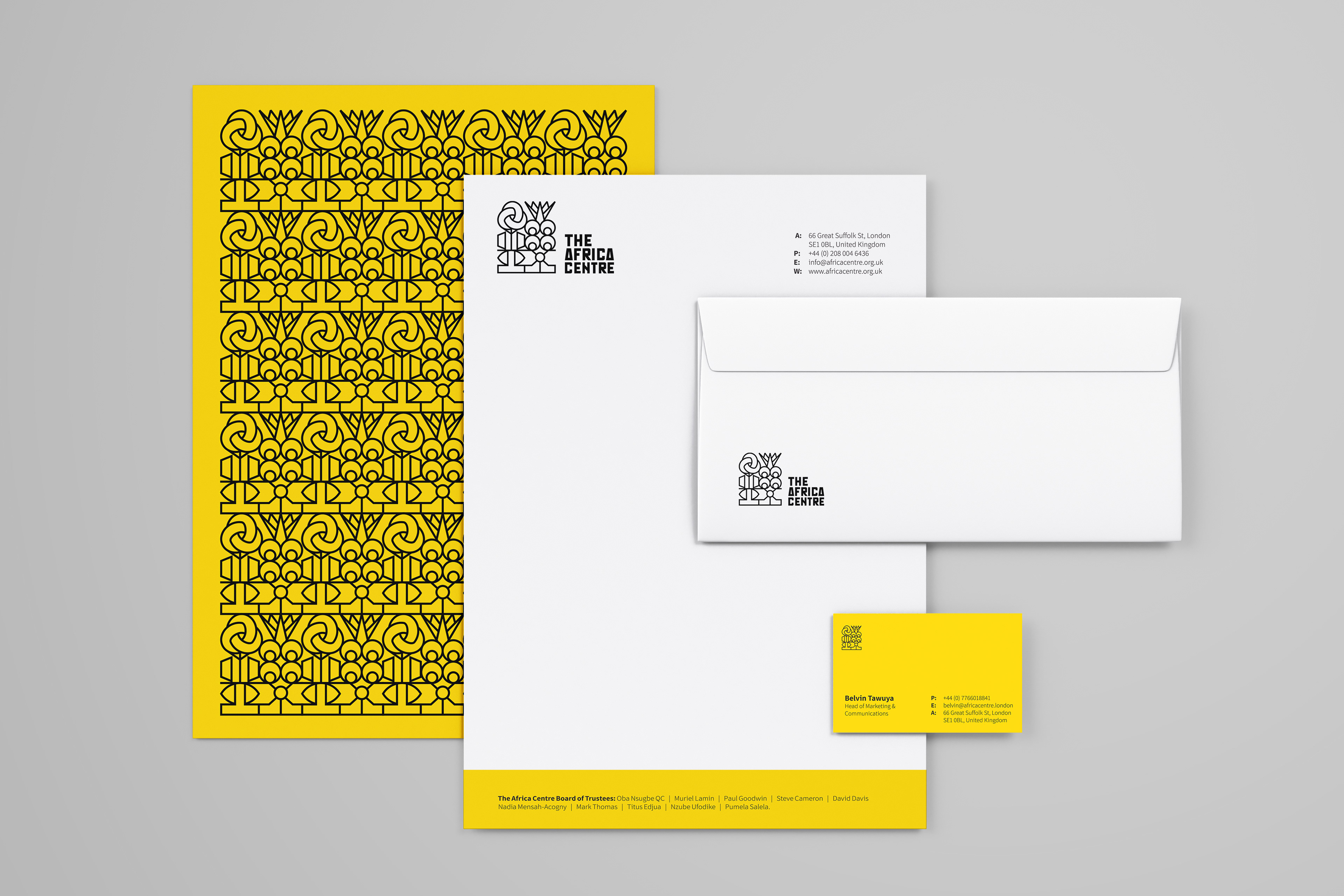
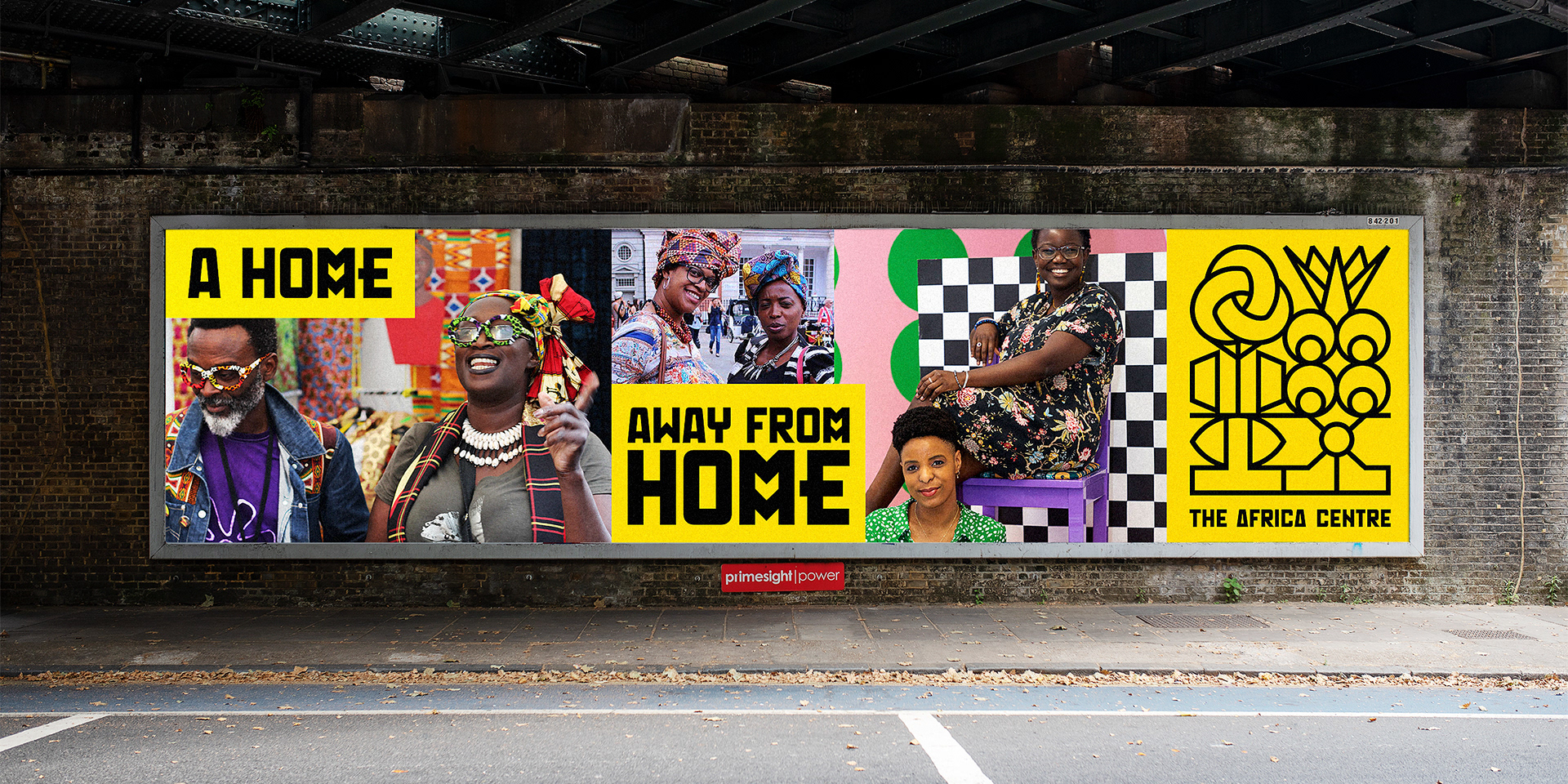
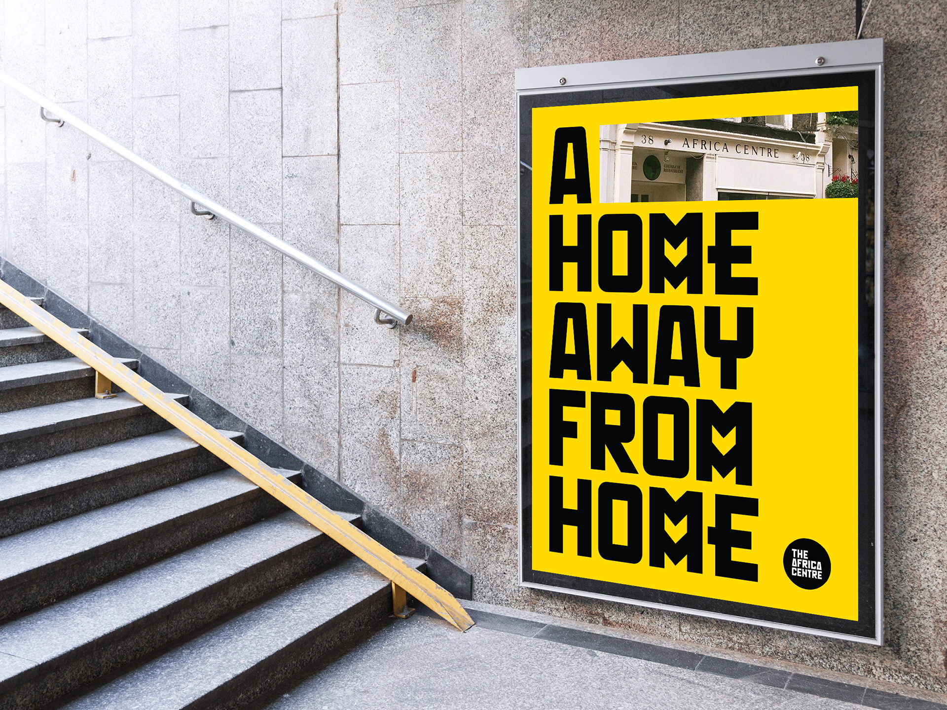
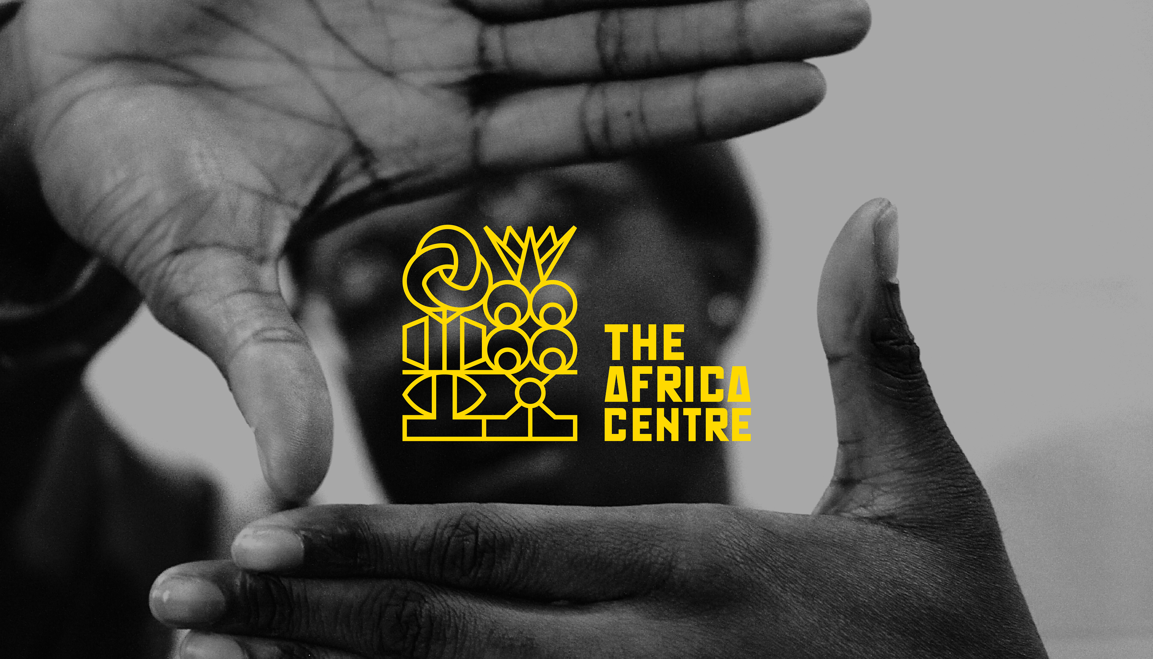
This rebranding of 'The Africa Centre' is a celebration of Africa's cultural richness and identity. In creating the brand's new identity we looked at the space that this organisation represents; It's a home away from home, a space for togetherness, the coming together of like-minded people. Essentially, the Africa Centre is a platform for people to gain knowledge and wisdom from one another.
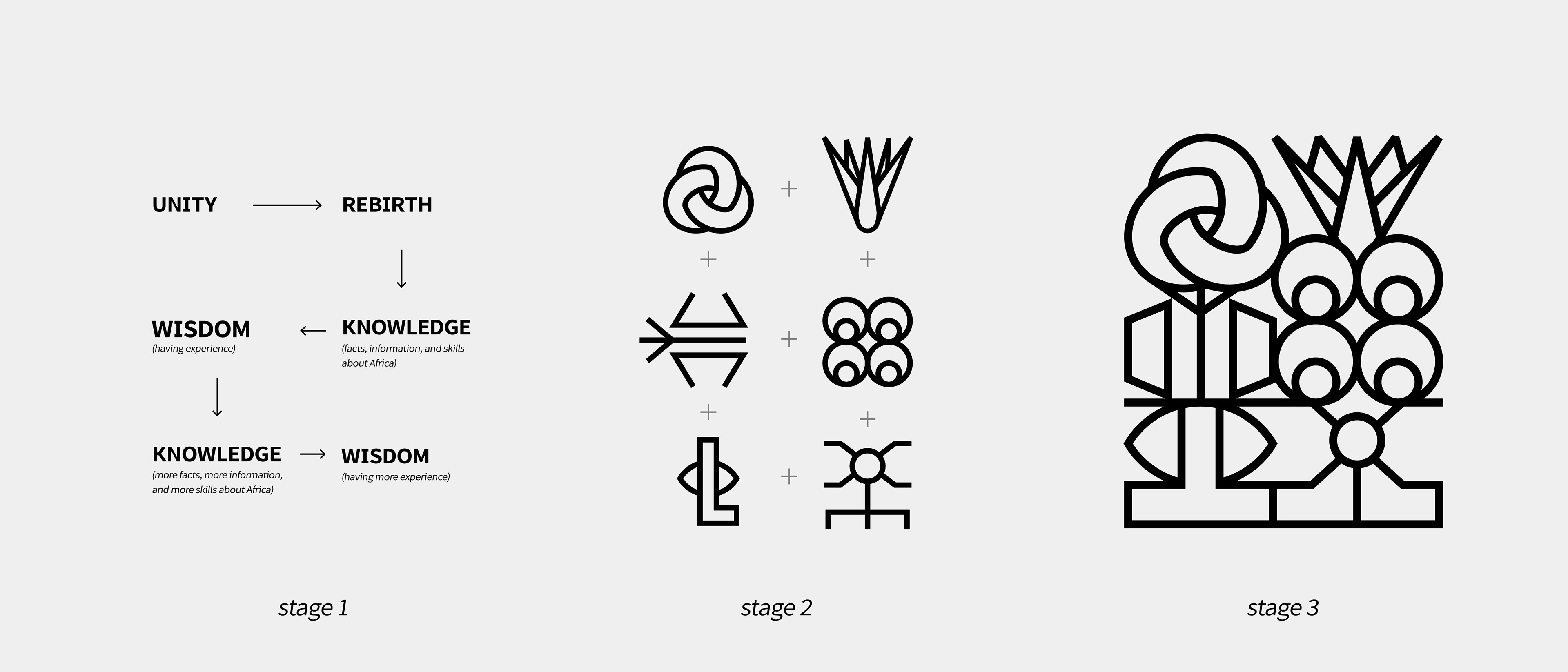
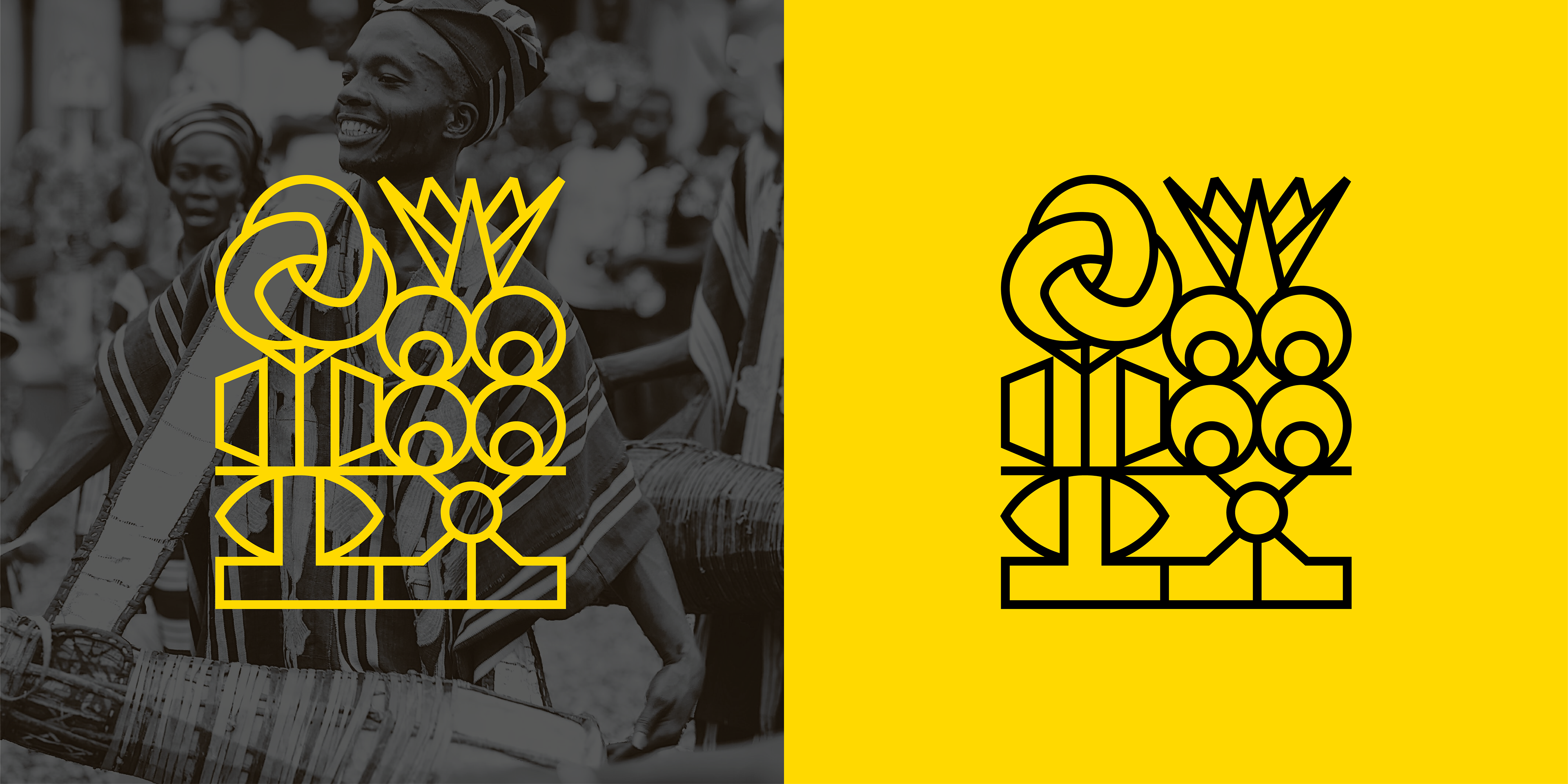
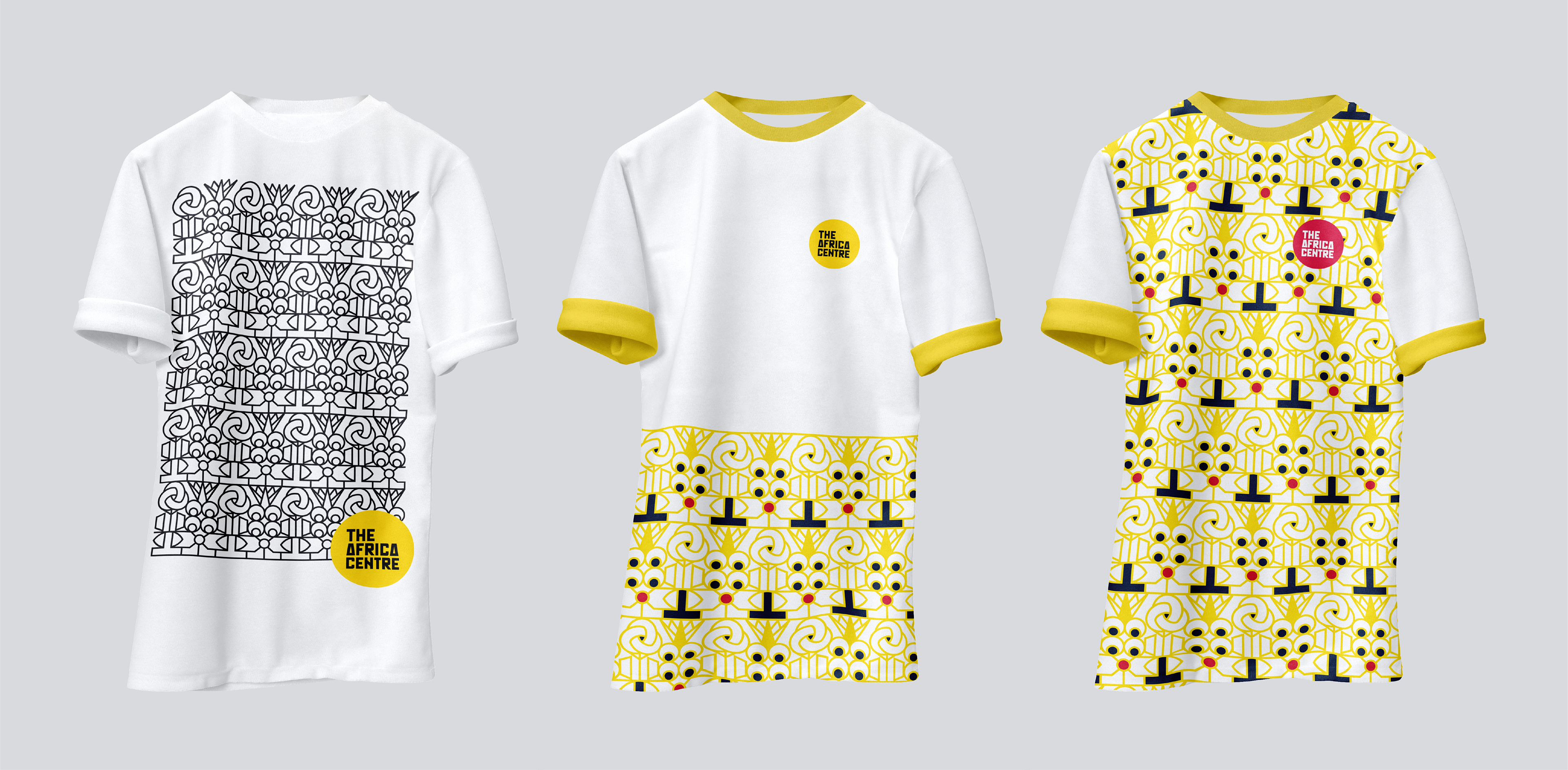
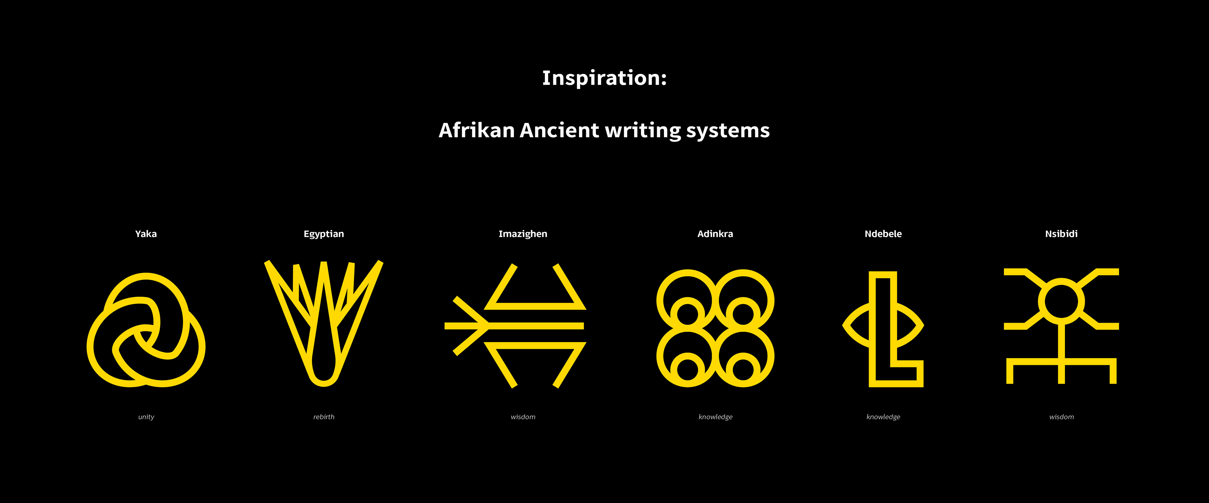
Which is why in the process of creating it's revitalised look, we were inspired to capture the spirit of togetherness/unity, realisation/rebirth, knowledge and wisdom into the design. These notions do not live separate from each other, they are in fact imperative to the design. But to tell this culturally-rich story, we first had to look back and be inspired by our continent's oldest forms of writing techniques. From Imazighen embroidery symbols, to ancient Egyptian hieroglyphics, to the majestic Adinkra, Nsibidi, Yaka and Ndebele mural symbols. Using ancient techniques of writing in our design symbolises the endless knowledge and wisdom gained from coming together.
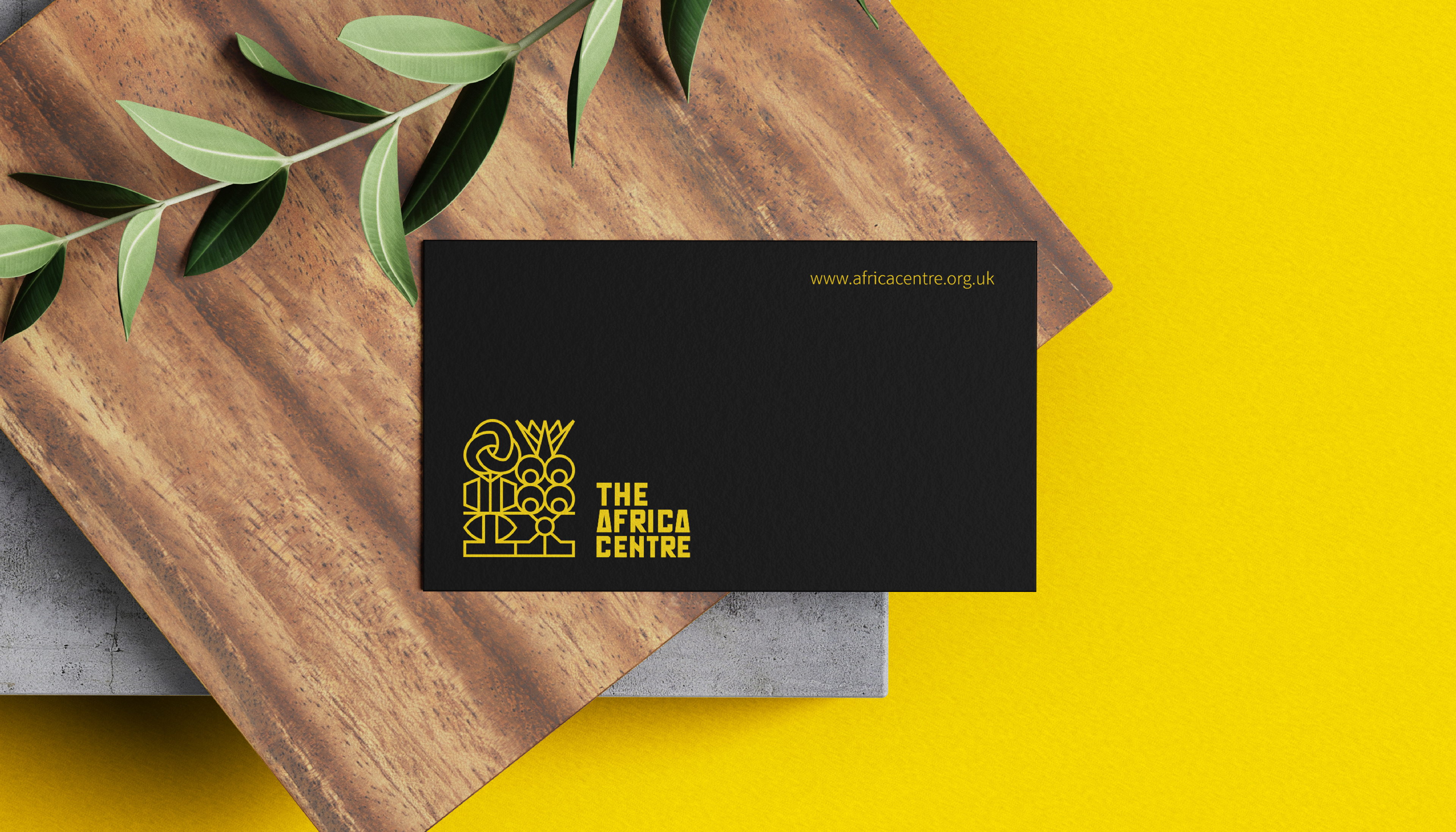
Lastly, as a modern representation of Africa's progression in writing techniques we employed the use of the Mutapa font for The Africa Centre's wordmark. A font recently designed by a Zimbabwean designer Tapiwanashe Sebastian Garikayi and it's based on the Mutapa Empire also known as The kingdom of Monomotapa.
Which is why in the process of creating it's revitalised look, we were inspired to capture the spirit of togetherness/unity, realisation/rebirth, knowledge and wisdom into the design. These notions do not live separate from each other, they are in fact imperative to the design. But to tell this culturally-rich story, we first had to look back and be inspired by our continent's oldest forms of writing techniques. From Imazighen embroidery symbols, to ancient Egyptian hieroglyphics, to the majestic Adinkra, Nsibidi, Yaka and Ndebele mural symbols. Using ancient techniques of writing in our design symbolises the endless knowledge and wisdom gained from coming together.
Lastly, as a modern representation of Africa's progression in writing techniques we employed the use of the Mutapa font for The Africa Centre's wordmark. A font recently designed by a Zimbabwean designer Tapiwanashe Sebastian Garikayi and it's based on the Mutapa Empire also known as The kingdom of Monomotapa.
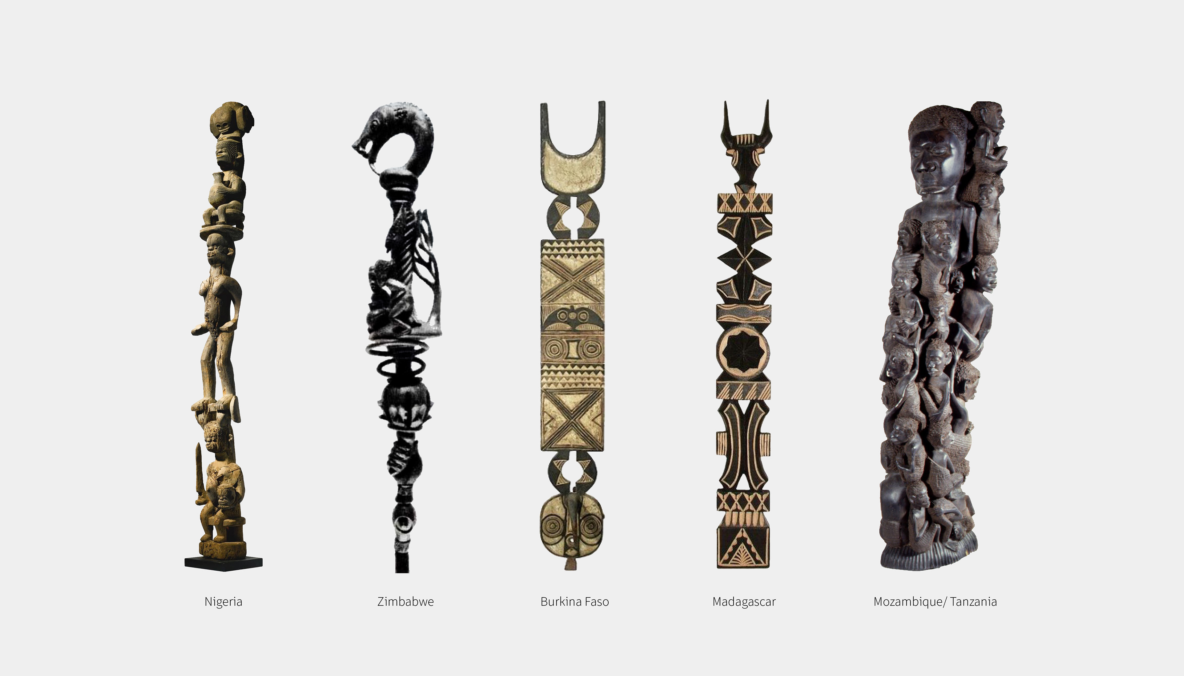
Our design reference or structure is influenced by African sculptures, staves and totems found across Africa, which have been used as form storytelling.